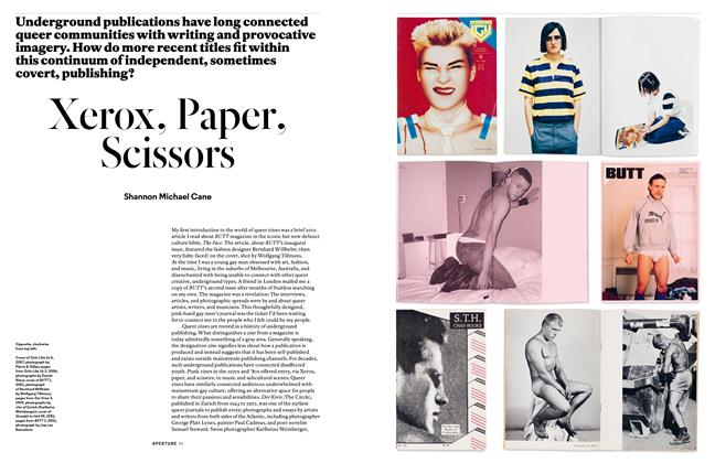
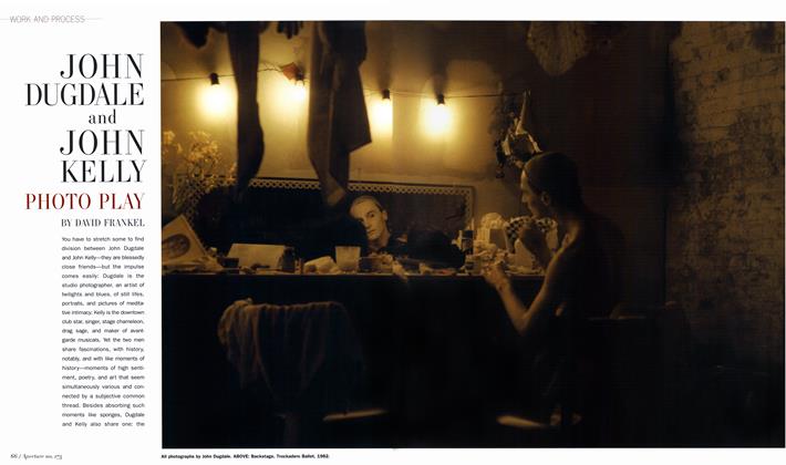
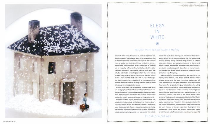
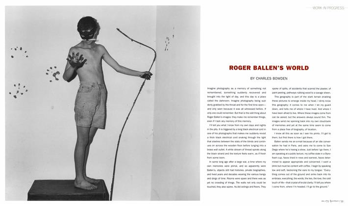
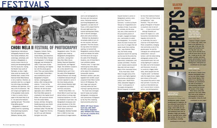
READING NEWSPAPER PICTURES
ESSAY
A Thousand Words, and Then Some
Philip Gefter
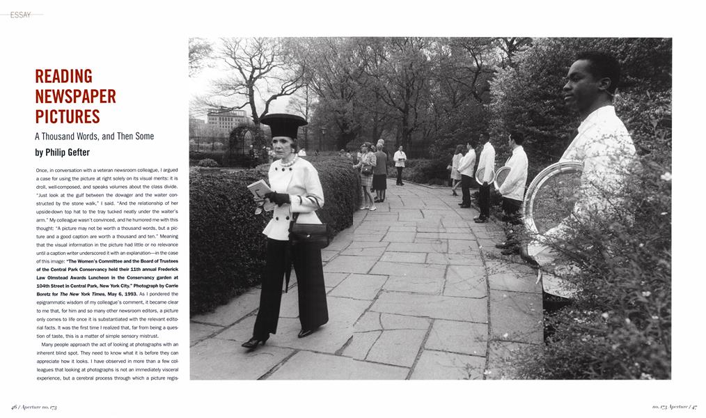
Once, in conversation with a veteran newsroom colleague, I argued a case for using the picture at right solely on its visual merits: it is droll, well-composed, and speaks volumes about the class divide. "Just look at the gulf between the dowager and the waiter constructed by the stone walk," I said. “And the relationship of her upside-down top hat to the tray tucked neatly under the waiter’s arm.” My colleague wasn’t convinced, and he humored me with this thought: “A picture may not be worth a thousand words, but a picture and a good caption are worth a thousand and ten.” Meaning that the visual information in the picture had little or no relevance until a caption writer underscored it with an explanation—in the case of this image: “The Women’s Committee and the Board of Trustees of the Central Park Conservancy held their 11th annual Frederick Law Olmstead Awards Luncheon in the Conservancy garden at 104th Street in Central Park, New York City.” Photograph by Carrie Boretz for The New York Times, May 6, 1993. As I pondered the epigrammatic wisdom of my colleague’s comment, it became clear to me that, for him and so many other newsroom editors, a picture only comes to life once it is substantiated with the relevant editorial facts. It was the first time I realized that, far from being a question of taste, this is a matter of simple sensory mistrust.
Many people approach the act of looking at photographs with an inherent blind spot. They need to know what it is before they can appreciate how it looks. I have observed in more than a few colleagues that looking at photographs is not an immediately visceral experience, but a cerebral process through which a picture registers first as a jumble of words that sifts through the filter of their brains before they can see what they’re looking at. For these individuals, the process of looking at photographs is once removed, something akin to a second language.
For many newsroom editors, the written word is the primary language; the photograph is a foreign tongue, and thus subject to interpretation—and so the greater the potential for inaccuracy. In the newsroom, then, pictures are considered a less reliable source of credible editorial information. As a picture editor, I experience this hierarchy of words and images as a form of prejudice, and in the face of it I resort to quoting Oscar Wilde: “It is only the shallow people who do not judge by appearances.”
Every picture carries the burden of its context: a newspaper picture provides information; an advertising image sells a product; a photograph on a gallery wall affords contemplation. The context is the language in which the picture needs to be read.
As I make my daily picture selections for the New York Times, I am confronted regularly with this conundrum: the best photograph— in terms of composition, narrative, metaphor, tone, and so on—is not always the right choice. In choosing pictures for the newspaper, the first consideration must be whether and how the picture addresses those essential questions of journalism: who, what, where, when, and why. At the same time, I look for pictures that serve two objectives: what it’s about and how it looks. When these two elements come together—a perfect marriage of content and form—then an unusual thing has taken place and my job, for the time being, is done. Of course, this does not happen every day.
There is no greater mystery than the truth revealed: the more direct a statement, the broader its scope. In language, a sentence in which the subject is laden with adjectives loses its shape and thus its impact. Anyone can write a good sentence or a bad one, and still impart the same information—just as you can take a good picture or a bad picture of the same situation. If we were to parallel sentence syntax with picture composition, the anatomy of either form is simple enough: subject/verb/ adverb, etc. The structure of the sentence reveals the writer as much as the structure of the picture reveals the photographer. A writer decides what to say and in what tone of voice, just as the photographer decides where to stand and when to shoot, choices that determine the quality of the image and reveal much about the intelligence of the photographer.
In the end, a picture might record facts, but without structure the facts are there as nothing more than evidence. What I tend to look for is evidence with observation.
The picture of a tea set on this page is at once straightforward and poetic. The delicate pieces seem particularly fragile covered with dust. The dust renders the feeling that the set is old, a memento of some kind, a still life taken out of time. As you look closer, though, you realize that everything here is covered in dust, the crumpled papers surrounding the tea set as well as the fabric
behind it. The pervasive dust suggests ominous possibilities: this artifact of a genteel age might have been left there after a bombing or a fire, who knows how many years ago.
Now read the caption and see how the facts amend that first impression: “A tea set in a Cedar Street apartment in lower Manhattan was still covered with dust from last week’s collapse of the World Trade Center buildings. The residents have not yet returned to the apartment.” Photograph by Edward Keating/The New York Times, September 19, 2001.
Again, the context in which a picture is seen determines the expectation about its contents. In this case, the picture was published in the New York Times a week after the 2001 attacks on the World Trade Center. It was immediately clear to readers of the paper that this picture was related to the September 11 coverage. These facts give the picture greater poignancy, and, to my mind, amplify what is inherently poetic about the image. Because of the visual simplicity, I believe that this picture’s iconographie significance will deepen over time.
Here is a sentence describing the scene in the picture opposite, at top: “A man in a suit stands behind the counter at a diner.” To the point, like the photograph itself. As you look at this picture, though, more information surfaces: the man leans forward and talks to the woman facing him. A woman eating lunch at the counter seems perturbed. Layers of visual information begin to tell a deeper tale, and a story comes to life within the frame. On the surface, it’s odd that a man in a suit would be standing behind the counter of an old-fashioned diner. The protagonist, his surroundings, the facial expressions of the people at the counter all come together, incongruous though these elements might be. The counter delineates a cushion of space around the protagonist, and also serves as a kind of buttress for the diners. The face of the woman in the foreground pulls an invisible barrier across the frame to the woman with white hair at the other end of the counter, a barrier that the man in the suit seems to push against with his gesture.
At this point, you may or may not recognize the protagonist. When this picture was made, he was not yet the most famous figure in the world. With more information about the circumstances of this photograph, the meaning grows. The caption: “George W. Bush, a candidate for President of the United States, campaigned at a diner in Iowa before the Republican primary.” Photograph by Stephen Crowley/ The New York Times, January 21, 2000. So that’s who it is. That’s why he’s wearing a suit. No wonder there are other photographers taking his picture. This, as they say, is a photo-op.
The picture’s handsome architecture puts the information together in a way that constructs a narrative arc. Even stripped of the knowledge that it’s Bush on the campaign trail, the picture continues to unfold on a more existential level. The man at the center of attention clearly does not belong there. He has caused the people eating to make faces; they may feel that they’re being exploited. That, at least, is my interpretation of this Norman Rockwell-like tableau.
The picture below on the same page is very different in structure from that of Bush, and has a much more whimsical subject. There is nothing conventional about the composition; there are no linear cues to direct you from subject to verb, so to speak. It requires imagination to ascertain what exactly is taking place. The bold, red stripes initially draw you in, as does the odd perspective. The man is pointing with an expression on his face not unlike those of the two animals; the animals seem to be responding to what he’s doing. On a purely visual level, the stripes seem to be linking the man’s actions to the animals’ behavior. Striped tent? An animal trainer? It’s plainly a circus environment. But, still, what’s the man doing? You might never guess: “Carlos Svenson, an animal trainer at the Big Apple Circus, teaches Jasper the horse and Smokey the dog to smile.” Photograph by Chang W. Lee/The New York Times, May 21, 2002. As a photographic subject, animals always tend to draw an affectionate response, and while this picture of Jasper and Smokey has its own compositional logic and visual charm, it takes on greater meaning when you learn what it is they’re doing. The thousand and ten words.
If statecraft is a kind of ballet, then the two world leaders in the picture opposite are dancing a pas de deux. We know who they are: President Vladimir Putin of Russia and President George W. Bush of the United States. The ceremonial nature of this moment is obvious from the gilded surroundings and the flags behind them. Bush and Putin are in perfect lockstep as they take their seats; in fact, they appear virtually interchangeable in mood, dress, and gesture. The editorial point of that day’s story was the like-mindedness of the two leaders as they signed an agreement, and the photographer intelligently waited for a moment reflecting that important detail. The published caption read: “President Vladimir V. Putin of Russia and President Bush at the signing ceremony yesterday for a treaty that mandates sharp cuts in nuclear arms.” Photograph by Stephen Crowley/The New York Times, May 24, 2002. This picture exemplifies a visual phenomenon I describe as the subtext revealed within the pre-text—a phenomenon that Crowley is particularly adept at capturing.
The picture above on this page is a visual one-liner if ever there was one. A cluster of photographers aim at a reluctant subject. That subject turns away to the lone photographer who made this picture, as if to say: “Get me out of this ludicrous situation!” The layers mount as you contemplate the subject, Woody Allen, the deadpan auteur-comedian, in a scene that could have come out of one of his own movies. It’s reasonable to conclude that the actual subject of this picture is not Allen, but the media cluster. The caption: “American filmmaker Woody Allen is photographed before the screening of his film ‘Hollywood Ending,’ which opens the 55th Film Festival at Cannes.” Photograph by Christophe Ena/Associated Press, May 15, 2002. Life imitating art imitating life: a perfect simulacrum.
The photograph above, by James Hill, taken for the New York Times on November of 2001 is graphic in its content, strangely geometric in its form. A battle scene, corpses, figures walking along a bullet-riddled wall. We are not used to looking at dead people; it feels as if we are violating a taboo as we stare at the picture. The cloaked figures in the background have the aura of death surrounding them, walking past the corpses like the march of time as the dead stand still.
This picture is a good example of the intelligence of the photographer being manifest in the frame. Hill chose to level his eye to the ground, rendering the corpses the immediate subject. He shot beyond them, to include the context of the battle scene and the perpetrators themselves. He framed the massacre carefully: as the figures march out of the frame, the balance of the picture shifts to the right, yet the dead man in the foreground remains the anchor; the other body a bridge to the walking figures—a bridge between life and death.
This picture was published twice in the Times, once the day after it was taken in November of 2001, and again a month later in a special section called “The Year in Pictures.” I mention this because the two captions differed significantly; the information had changed over time, in content but more particularly in context. The first read: “The bodies of Taliban prisoners lay strewn across the inside of the fort at Qala Jangi as troops belonging to the forces of General Abdul Rashid Dostum walked by.” Photograph by James Hill for The New York Times, November 29, 2001. The second caption, written after a month during which more information had surfaced: “In a 19th-century fortress in northern Afghanistan, Alliance fighters spent three furious days in November quelling a rebellion of hundreds of Taliban prisoners, several of whom lie dead here. An early victim of the uprising was CIA officer Johnny Michael Spann, who had been interrogating John Walker Lindh, discovered at the fort as the first known American Taliban fighter.”
The first caption reported news; the second caption reported history. Pictures sometimes take on new sets of meaning with time.
More recently, imagery from the war in Iraq saturated the media, but no picture captured the fall of Iraq more poignantly for me than the one above. While not the signature image of the statue of Saddam Hussein toppled by American soldiers, this picture takes on metaphoric significance: the marble statue of a fallen tyrant upholds the appearance of normalcy, despite the ravages of war that surround it. Destruction here is amorphous: smoke and flames merge into an unarticulated field of pure color against which the rigid outline of a once-powerful leader stands—hollow-white, in contrast—its demise implicitly anticipated. “A statue of Saddam Hussein stands in front of the National Olympic Committee building as it burns from a U.S. military attack in Baghdad, Iraq.” Photograph by Tyler Hicks/The New York Times, April 9, 2003.
The difference between art and journalism begins with intention. Art derives from a contemplation of ideas, while journalism reports on facts and events. When a fact is reported (or photographed) in such a way that it becomes an observation as well, it takes on meaning beyond the burden of proof. The fact becomes, then, something witnessed, something experienced. Defined. These pictures were taken for editorial purposes, each as a record of a moment or an event. Each tells a story in a selfcontained narrative that observes the evidence, and renders the experience of that observation our own. ©
Philip Gefter
-
 Reviews
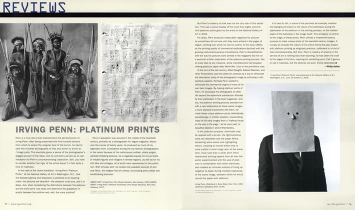
Irving Penn: Platinum Prints
Spring 2006 -
 Before The Lens
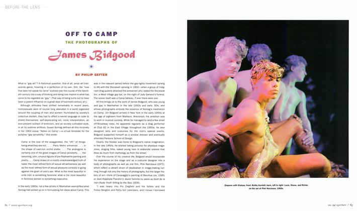
Off To Camp The Photographs Of James Bidgood
Summer 2008 -
 Words
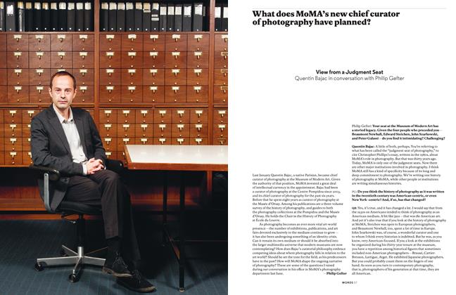
WordsView From A Judgment Seat
Winter 2013 -
 Words
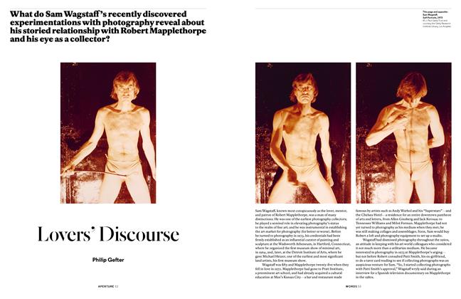
WordsLovers’ Discourse
Spring 2015 -
 Pictures
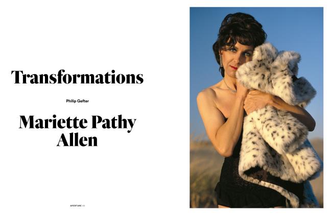
Transformations: Mariette Pathy Allen
Winter 2017 -
 Words
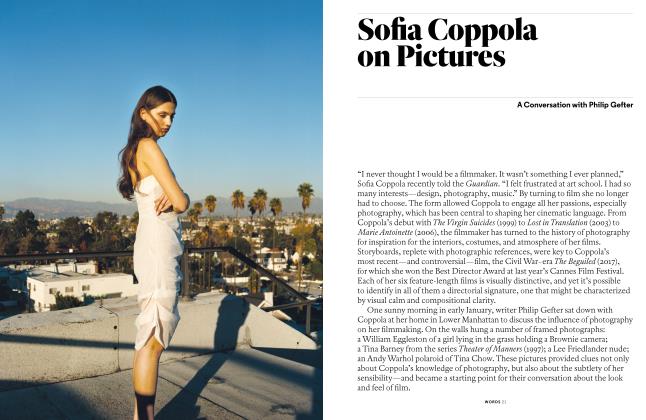
WordsSofia Coppola On Pictures
Summer 2018