Essay
The Forest For The Trees
THE FOREST FOR THE TREES
ESSAY
GEOFFREY BATCHEN
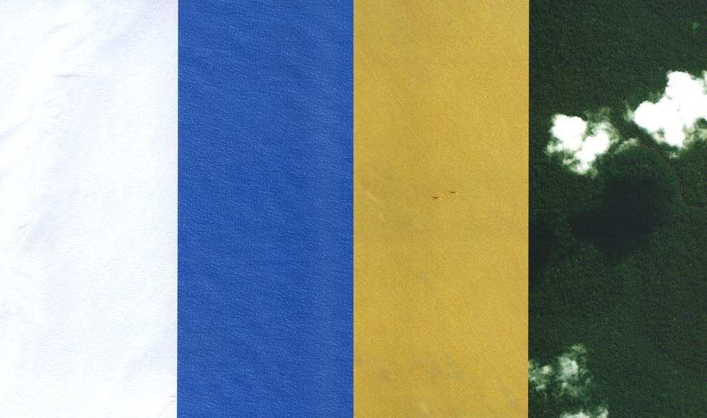
A thin line wends its way through an undulating sea of green, like the trail of a parasite burrowing into the bark of a tree. The analogy is an apt one: what we are looking at is a photograph of a rainforest in the southeast of Cameroon, and the line, a dirt road, represents the trail of destruction wrought by illegal logging in one of the world’s few remaining pristine forests. American architect Laura Kurgan renders this usually invisible activity visible, and she does so by deploying an omnipresent technology that is also usually invisible: satellite photography. Working in collaboration with Global Forest Watch, an environmental organization, Kurgan ordered a detailed image of a small section of the Cameroon forest as photographed from Ikonos, one of the many commercial satellites that now circle high above our heads. She then had it printed to a very large scale, presenting a vertical 84-by-40-inch slice of cloud-dotted landscape seen from far above. This is an image that is at once beautiful and ominous, abstract and realist, conceptual and grounded. It speaks about environmental destruction and its possible prevention, but also about the architecture of contemporary surveillance photography. Both literally and metaphorically, it asks us to look closely, very closely, at the trees, in order to see more clearly the larger ecosystem of which they are a part.
The image is one of four “Monochrome Landscapes” (2004), recently shown by Kurgan as part of a group exhibition, “Architecture by Numbers,” at the Whitney Museum of American Art at Altria. The subjects of the other three images were decided along similarly strategic lines. The first, a textured strip of white snow, shows a view of the Arctic National Wildlife Refuge in Alaska photographed from the QuickBird satellite on April 7, 2003. This is the wildlife refuge that the Bush administration has proposed should be drilled for oil. Oil also figures, although obliquely, as a theme in the third panel. It shows a golden strip of the Iraqi desert during the second week of this invasion, as seen by the QuickBird at 7:32 GMT on March 30, 2003. The undulating monotony is broken only by the miniature forms of two
helicopters flying in formation, ominous mosquitoes of foreign occupation in action. Kurgan has separated these two panels from each other with a similarly deadpan view of blue ocean, an expanse of the Atlantic at that point where the equator and the prime meridian intersect. This invisible crossing of lines was decided at an international conference held in October 1884, to “fix upon a meridian proper to be employed as a common zero of longitude and standard of time-reckoning throughout the whole world.”
White, Blue, Yellow, and Green: with these four vertical stripes, Kurgan has produced a geopolitical map of our times, and with it a minimalist rendition of mapping itself, of its processes and consequences.
Kurgan’s work finds its place in a long history of aerial photography. One of Louis Daguerre’s first daguerreotypes shows the view from his studio window, looking down into the Paris street below. This link of a mechanical mode of seeing and a desire for a surreptitious view from above was finally made manifest by Félix Nadar in 1858, when he took the first photograph from an airship, a balloon floating above Paris. The topographical view, an ancient and iconic representation of the world, projected from an imagined point above the earth (consider the town plans of the Sumerians, or the paintings of Australia’s aborigines), was now joined by a picture created by
light bouncing off that earth and into a camera. One could at last see from the point of view of a bird, or perhaps even of a god. One could see things never before seen, a mode of visually that has since generated new regimes of power as well as new pictorial possibilities.
It wasn’t long before such technologies were harnessed to the needs of warfare. Aerial photographs much like Nadar’s were used during the American Civil War and during World War I. No less a figure than Edward Steichen commanded the photographic section of the American Expeditionary Forces in the latter conflict, and he claimed then that “at least two-thirds of all military information is either obtained or verified by aerial photography.” That claim is certainly still valid today. World War II, extensively documented and propagated via aerial photography, also produced some of the genre’s most chilling examples: the views of an obliterated Fliroshima after it had been hit by the atomic bomb on August 6, 1945. The high stakes involved in such apparently passive picturing practices became particularly evident on October 16, 1962, when the CIA presented President John F. Kennedy with photographic “proof” that Soviet missiles were being installed in Cuba. As Americans and others began rehearsing for nuclear war, these photographs were presented first to the press and then to the General Assembly of the United Nations as “irrefutable evidence” of hostile Soviet intentions. These various political maneuvers were made possible by what was then recently introduced technology. New lenses allowed detailed images to be made from U2 planes flying at forty thousand feet overhead, and a technique known as “peripheral photography” enabled planes to take pictures of Cuba without flying directly over that country. But this incident also underlined a continuing theme in
surveillance photographs: the subjective nature of their interpretation. As Robert Kennedy recalled about the CIA briefing he received: “I, for one, had to take their word for it. I examined the pictures carefully, and what I saw appeared to be no more than the clearing of a field for a farm or the basement of a house."
The technology has continued to advance, although the issue of interpretation remains problematic. Detailed resolution of images showing objects only a few centimeters in size (in some military applications at least), an ever-increasing number of steady satellite platforms, and enhanced digital capabilities have all come together to make remote visualization an everyday aspect of postmodern life. And this visualization is no longer confined to military targets. In July 1972, NASA’s Earth Resources Survey launched its Landsat satellite into fixed orbit and a steady stream of images of the earth’s surface has been the result. Weather prediction, agriculture, cartography, law enforcement, oil exploration, navigation, disaster relief, and urban planning have all benefited as such images have become publicly available. Landsat has since been joined by Sovinformsputnik, SPOT, Ikonos (Space Imaging), and many other commercial satellites, providing a continuous flow of visual data back here on earth, and (for a fee) detailed static images of particular sites composed from that data. It’s not the existence of these surveillance systems that is the central focus of Kurgan’s work; it is, rather, their means of production and dissemination. What is the architecture of this flow of image information? What is done with it and to what ends? How can its design parameters (and the politics invested in them) be identified and engaged by ordinary citizens?
Kurgan has already pursued these questions in a number of previous projects. In 1994 and 1995, she exhibited You Are Here: Information Drift, two works in which she made drawings using the Pentagon’s Global Positioning System (GPS) of twentyfour satellites as her stylus. These drawings comprised a series of corrected and averaged points that traced her interaction with outer space. The work was thus both a self-portrait and a realization of virtual architecture. Of this work, Kurgan writes: “The GPS information refers to but does not simply represent the space it maps: it exceeds, transforms, and reorganizes this space into another space. Not a representation of space, but a space itself. Or rather, spacing itself, passage and inscription, light and motion, transformation and interface.”
In a 1999 project, she employed the French SPOT satellite to access and present surveillance images of a landscape in Kosovo that had been the site of ethnic cleansing. Titled SPOT 083-264, Kosovo, June 3, 1999, the work consisted of previously acquired images purchased from SPOTImage, displayed both in very large prints and in small, extreme close-ups. The project served as a way of investigating, testing, and reframing visual information, using independent, commercially available imagery, in this case the unprecedented flow of hitherto-classified satellite images issuing from NATO and Pentagon sources during the Kosovo conflict. But it also made possible some reflection on the nature of the information itself. Kurgan writes: We know how to read this image, more or less, because we know what the colors of the pixels conventionally represent: red is vegetation, purple is marshland or farmland, blue is roads, buildings and bare soil, dark blue is clear water, white is clouds of smoke, and black is something burnt. But add to this something else we know about these picture elements: that they present data. Each pixel designates 20 square meters. Each one has an address, expressed in longitude and latitude, corresponding to a unique territory on the face of the earth. And each one has a signature, the heat value of that place at the time the satellite passed silently above. That value is expressed as a number, which has in turn an assigned standard false color. The satellite gathers data— we see an image.
Kurgan’s “Monochrome Landscapes” repeat elements of both these earlier installations, but with some important differences. By working with Global Forest Watch on one of the four images, Kurgan channels the financial resources of the art world into a form of international environmental activism. The images we see are of virtually “military” quality, more than eight hundred times more detailed than a Landsat satellite picture. While the Landsat and SPOT satellites gather their data automatically, on a predictable schedule, the Ikonos cameras need to be “tasked.” Kurgan has used both systems for this work, ordering two of her images from existing databases and obtaining the other two by sending satellites to train their digital eyes on a particular set of geographical coordinates, each of them bearing a historical or political load. Photographs tend to be equated with realism, but here, as false-colored indices of radiant heat, they are merely vehicles for the visual manifestation of data. Although both the installation and its individual images flirt with abstraction, recalling the monochrome color fields of Minimalist art, they nevertheless enable us to see information that would otherwise remain entirely abstract. As a “real allegory” (Courbet would likely recognize Kurgan as a fellow traveler), the “Monochrome Landscapes” collapse any distinction between these four ecosystems and the artificial nature of electronic signals that now permeate our atmosphere. Most importantly, the public presentation of such images reverses the usual order of contemporary surveillance, allowing ordinary citizens to look down, make snapshots from space, and check upon the state of their own planet. ©
More From This Issue
-
 Work In Progress
A Procession Of Them: The Plight Of The Mentally Disabled
Spring 2005 -
 Mixing The Media
Culture In Context: Photographs In Vince Aletti's Magazine Collection
Spring 2005 -
 Photographer's Project
Grandes Mujeres: Photographs By Bay Messina
Spring 2005 -
 Work And Process
Hiroshi Sugimoto: Enigmatic Objects
Spring 2005 -
 Profile
Re-Inventing The Spaces Within: The Images Of Lalla Essaydi
Spring 2005 -
 Selected Books Excerpts
Jacques Henri Lartigue: The Invention Of An Artist
Spring 2005
Geoffrey Batchen
-
 Pictures
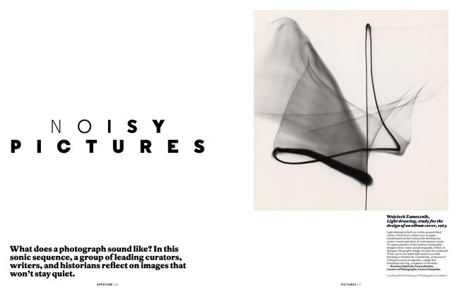
Noisy Pictures
Fall 2016 -
Phantasm
Summer 1994 -
 Book Excerpts
Geoffrey Batchen: Forget Me Not: Photography & Remembrance
Winter 2004 -
 Reviews
The Pictures Generation
Spring 2010 -
 Words
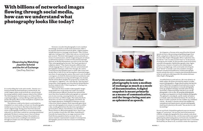
WordsObserving By Watching: Joachim Schmid And The Art Of Exchange
Spring 2013 -
 Redux
ReduxRediscovered Books And Writings
Summer 2017